PROJECTS
![]() 2006 The Absolute Report
2006 The Absolute Report
The book edited by APSOLUTNO
Contributors in the book:
Andreas Broeckmann / Berlin
C5 / San Francisco
Inke Arns / Berlin
jodi / Barcelona
Konrad Becker / Vienna
R. LeE Montgomery / Oakland
Marina Gržinić Mauhler / Ljubljana
Nina Czegledy / Toronto / Budapest
PLATFORM / London
RTMark / United States / Paris
Stephen Kovats / Rotterdam
Vuk Ćosić / Ljubljana
Geert Lovink / Amsterdam
Lev Manovich / San Diego
Minja Smajić / Stockholm
Darko Fritz / Amsterdam / Zagreb
Gebhard Sengmüller / Vienna
Dejan Sretenović / Belgrade
Aleksandar Bošković / Belgrade
Florian Schneider / Munich
Rossitza Daskalova / 1967 - 2003
The book was designed by Irena Woelle, Slovenia
Introduction
The late 1990s were a time of intense activity, networking and East-West collaboration in contemporary arts in the former Eastern Europe. Discovery of new fields of art practice, redefinition of one's position as an artist in a climate of changing social, political and cultural contexts, the establishment of new systems of communication and collaboration, and the emergence of new technologies in art practices all marked that period. Association APSOLUTNO was part of that wider scene, which was in stark contrast to the claustrophobic context of Serbia within which the members of APSOLUTNO lived and within which the production of the association was created.
This book is an Absolute Report of the last five years of the 20. century from the perspective of a specific artistic network that was active at that time. We present the projects that APSOLUTNO created in that period as well as reports by various artists, media thinkers and other important personalities that APSOLUTNO met within the same East-West network in the sphere of new art & media practices. In this book we find parallels between our own projects and those of others, by identifying four important themes that run through the work created at that time: time, space, code, and memory.
These themes arose in the work of APSOLUTNO as a response to the immediate social surroundings in which APSOLUTNO lived and worked. The guiding principle of APSOLUTNO was search for the sites and situations with a symbolic or metaphorical potential in relation to a wider social context. We refer to these found situations as absolutely real facts because of their hidden interpretive quality. Taking absolutely real facts as a starting point for our interventions, we turned the familiar, usual, or even marginal, which is often no longer even perceived, into something unusual, out of the ordinary, and worth further exploration.
Time, space, code and memory are also present in the works by other participants represented in this book. In spite of the variety of approaches, it is evident that this activity, taken as a whole, reflects the existence of a specific epistemological community.
association APSOLUTNO
spring, 2006
To download The Absolute Report book please click the folowing links:
![]()
The Absolute Report-cover.pdf (18.4k) |
The Absolute Report-introduction.pdf (50.2k) |
The Absolute Report-contributors.pdf (126.9k) |
The Absolute Report-time.pdf (278.5k) |
The Absolute Report-space.pdf (635.7k) |
The Absolute Report-code.pdf (700.7k) |
The Absolute Report-memory.pdf (282.5k) |
Reading room
As reading is primarily a solitary process, we want to create silent, autonomous, spaces for reading, browsing, research and reflection. The reading room will therefore contain 6 to 8 reading boxes, physically separated by transparent curtains. The books will be placed on shelves within these boxes. Therefore, the user has to search for the books by entering the boxes. Books should ideally be sorted by topics (but it is also possible to sort them alphabetically) and information about the contents of each box will be visible on the outside of the boxes. Thus, the user makes decisions which boxes s/he wants to enter.
To create an atmosphere of a radio studio, the walls in the reading room will be covered by blocks of black sponge, thus emphasizing the idea of a silent space. This will also make the room darker. In contrast, the reading boxes will be brightly lit by reading lamps, signifying spaces of intense activity. Each box will have a red light bulb on top of it, with “on-air” / “off-air” signs. As the reader enters the reading box, the on-air sign switches on (activated by a photo sensor), signaling that reading activity is taking place and also indicated to other readers that the activity should not be interrupted. (As the curtain is transparent, it will be visible when the box is occupied). When the reader leaves the reading box, the sign switches to “off-air”.
Computer room
The idea for the computer room is to create a space not only for consuming information through the archive and the internet but also for exchange of information. Therefore, the walls of the room will be covered by white wall-paper, with links to sites about the radio printed on them, and also with spaces for users to add the sites they consider important or interesting. Markers will be provided for that purpose.
The computer room follows the same layout as the reading room: the computers are placed along the three walls. In the middle of the room, as a central meeting point, is the CD and DVD archive, placed in a box whose front side and top is covered in the same wall paper as the walls. That way the users can write down their favorite links on the box as well, as they come to take or return the materials from the archive.
<<< links >>>
![]() 0000 “We
Must Accept The Unacceptible”
0000 “We
Must Accept The Unacceptible”
WE MUST ACCEPT THE UNACCEPTABLE (original in Japanese)
Signature:
Absolutely Real Facts - Series 0000
In
this installation the three buildings of the military clothes
factory in Hiroshima are marked as 'museum artefacts' as they are
witnesses to a historical event. Association APSOLUTNO includes these
buildings into the inventory of the 'absolutely real facts' of the 20th
century. This site thus becomes a point of special significance for our
civilization, which opens up questions about un/acceptability in the
context of the past and the present.
![]() 0000
Serbeiko
0000
Serbeiko
SERBEIKO
is a video-installation which represents a strong association of reading of
times. It is an authentic interpretation of social circumstances in Yugoslavia/Serbia.
At the same time this video installation emphasizes an ironic perspective
on the absolutely exact (Serbian) time. As a direct associative connection
of the precise control of time, the well-known logotype of the famous Japanese
company SEIKO was taken as a basic platform for the title of the installation.
The name SEIKO was visually transformed into SERBEIKO - this enabled perseverance
of the sound association of the name of the installation in relation to the
original sample. As a metaphor of an absolutely real fact (arf), in this video
installation was used a computer and graphic animation of the clock-image
taken from the state television broadcasting - RTS (Radio Television of Serbia).
SERBEIKO
was shown for the first time at the exhibition "INSOMNIA" in January
2000 in Belgrade.
The
premiere of the video screening took place at the Belgrade Festival of the
Short and Documentary Film in March 2000.
![]() 0001
1999aA0001
0001
1999aA0001
video
installation
VEAG - Media façade
Berlin, VEAG Company
Berlin 27 August 1999
Concept of the installation 1999 aA 0001
The
starting idea for the installation for the VEAG building media facade was
the notion of energy, the main product of VEAG. In the installation association
APSOLUTNO aims to point out both the energy produced, controlled and used
by man, and also the energy of a human being and its creative potential. This
idea is developed in the installation through a number of complementary elements:
man - machine, black - white, letter - number, sound - movement. The idea
can also be seen on the level of the realization of the video sequence, which
includes a graphic animation on the one hand and a filming of an actor on
the other.
The
installation is clearly divided into two complementary sets of screens: horizontal
and vertical, taking into account the architecture of the building and the
position of the screens. While each set of screens has its independent existence
as a visual whole, both of them together represent a dynamic composition with
a specific rhythm of both synchronised and separate sections. As the architecture
of the VEAG building gives an impression of solidity and stability, with its
emphasized vertical elements, our idea is for the installation
to create an effect of the building in movement: at one moment in the horizontal
screens the 'generators' start moving faster and faster, which will create
an illusion that the building is moving on its "wheels".
Taking
into account that the installation will be viewed from various distances and
perspectives, a passer-by walking on the pavement, a driver in a
passing car or a passenger on a bus will see the video wall as an animation
sequence at different speeds.
The
whole installation rests on the minimalist principle and simple aesthetics
as a contrast to the present hyper-production of video clips full of various
high-tech effects. In the medium itself, there are two complementary elements,
reflecting the main idea of the installation: graphic computer animation (machine)
and a filmed actor (man).
The installation is realized in three colours only: black, white and red;
black and white as symbols of two opposite poles, and red symbolizing energy.
Description of the installation
There
are two segments of the installation:
horizontal screens make up one, while the vertical screens make up the other.
The whole installation is based on the interplay between what is going on
in
these two parts. For the purposes of clarity, the description of the installation
will be given in steps.
Step 1
Horizontal
screens
Mouth of a man (zoom), black and white. The person is uttering the sounds
of the German alphabet. One can recognize the sounds if closer attention is
paid
to the movements of the lips. The screens show the same video sequence but
not in synhronisation. When in one of the screens the mouth utters again the
sound A, it stops with the alphabet and continues uttering the sound A only.
Gradually, on all screens one can see the same mouth uttering the sound A.
Vertical
screens
All the screens are white. Black letters, of all sizes and typographic shapes,
start appearing on the surface, as if falling onto it. They appear in random
order, creating a graphic dynamics. As these black letters 'fall' onto the
white surface, one over the other, the surface gradually becomes black. At
the
moment when all horizontal screens show the same picture (the mouth uttering
the sound A), all the vertical screens are black.
Step 2
Horizontal
screens
The mouth uttering the sound A forms the shape of a circle. At one moment,
on all the horizontal screens, the circle of the mouth is replaced with the
circle of a cross section of a generator. The starting position is static:
a white drawing on the black screen. Gradually, on all the screens, at the
same time, the generators start to roll. The movement is faster and faster
until the generators start spinning and becoming red. Red colour gradually
covers all the horizontal screens.
Vertical
screens
On the black screens, just like previously letters, now there are displays
with numbers appearing on the black surface. All the displays are red. In
the same
way, the numbers fall onto the black surface making it red. The displays appear
on the screen at the speed and dynamics which matches the speed of the
generators in the horizontal screens. Gradually, all the vertical screens
become red, so now all 18 screens are red.
Step 3
Horizontal
screens
The red screens disappear one by one, starting from the left (like sound display
- led netter). At the same time, the mouth appears again in each of the screens
and starts uttering the alphabet. When all the screens show the mouth, the
whole sequence starts again.
Vertical
screens
In the same way, the red screens disappear one by one and are replaced by
white screens. When all the screens are white, the whole sequence starts again.
The Semiotics of Confusion. In: Kovats, S. (Ed.), /Ost-West Internet. Media Revolution. Electronic Media in the Transformation Process of Eastern and Central Europe/ (pp.242-255). Edition Bauhaus - Band 6. Frankfurt/New York: Campus Verlag
Introduction
The idea for this piece of writing arose from the visual research association APSOLUTNO conducted from 1995 to 1998. The research was focused on the national symbols in official use in the Federal Republic of Yugoslavia during that time. APSOLUTNO documented flags, border-markers, coats-of-arms and other national and state symbols, banknotes, passports and other official documents issued by the authorities, as well as various public individual responses to these. In addition to this visual material, other symbols and reactions to them were documented as well (e.g., the reactions of the audience to the national anthem played at international sport events). This text will be based on a segment of the visual part of the documentation.
The aim of this action of documenting was to record a phenomenon in our immediate surroundings by collecting absolutely real facts here and now. It is important to note that the absolutely real facts are arbitrary to a certain extent, determined by the time and place where they were collected (on various irregular occasions from 1995 to 1998, in Novi Sad and Belgrade, Yugoslavia). They nevertheless illustrate the variety of semiotic activities, both official and individual, which in an interesting way reflect (sometimes follow, sometimes anticipate) events in the social and political sphere.
The reason why this text has no conclusion is very simple: the state of affairs in this area is still in flux and as we are writing, the confusion is only being multiplied.
I
Since 1991 five new states have emerged on the territory of ex-Yugoslavia, and it is very likely that this process has still not been completed. On the semiotic level, this process of disintegration and formation has been followed and in some cases preceded by feverish symbol-engineering: old national and state symbols have been discarded, ancient ones revived or recycled and completely new ones designed. New authorities attached enormous significance to the introduction of new symbols, as through these it was possible to create a new sense of national identity, national pride and a new political and ideological framework for future orientation. In other words, the change on the symbolic level was seen as an important vehicle of political change, as communication via symbols was a language that people understood and to which they responded.
The urgency and importance of the introduction of new national symbols are easy to illustrate if the dates when laws regulating the use of national symbols were passed are compared with the dates when the new states were officially established. In Croatia, for example, the constitution of the Socialist Republic of Croatia was amended in July 1990, when the word socialist was dropped from the name of the country, the red star removed from the country's national flag and the socialist coat-of-arms replaced by Croatia's historical coat-of-arms. Law on the Coat-of-Arms, the Flag, and the National Anthem of the Republic of Croatia was adopted in Parliament on 21 December 1990. A day later, on 22December, Croatia passed a new constitution, which allowed for secession from the former Yugoslav Federation.i
The process was similar in Slovenia, which declared itself a sovereign state on 25 June 1991 and, at the same time, introduced a new flag and coat-of-arms. On that day the new flag was hoisted officially for the first time in front of the Slovenian Parliament, and beside it, the old flag with the red star was lowered, in a symbolic gesture of replacement.ii
However, this process of changing national and state symbols was not always clear and straightforward. In some cases it meandered, touching upon various issues and sometimes coming across unexpected reactions internally or externally. Problems in the semiotic area only reflected either external pressures (as in Macedonia), or the unresolved issues within the state itself (Bosnia), or they indicated a basic lack of a clear idea about the future direction (FRY). We shall briefly give an overview of some of the related issues, focusing on the flag as one of the central national and state symbols, and excluding for the moment the Federal Republic of Yugoslavia.
As already mentioned, in Slovenia and Croatia, the national flags used in those countries while they were part of the Socialist Federal Republic of Yugoslavia (tricolours with the red star) continued to be used after the removal of the red star. However, in Macedonia and Bosnia completely new flags had to be designed.
In Macedonia, a new flag was adopted at independence in August 1992. The design was selected from more than a hundred proposals which entered an open competition. The flag immediately came under attack from Greece, which maintained that the Vergina Sun, the central symbol on the flag, belonged to Greek cultural heritage. Greece also protested against the use of the word Macedonia as the official name of the new state. The dispute was resolved in 1995 by a UN agreementiii, according to which Macedonia was recognised as "The Former Yugoslav Republic of Macedonia" and was required to design a new flag within 30 days. The present flag of Macedonia, proposed by a group of Members of Parliament, was finally adopted in 1995, three years after independence. Nevertheless, the name of the country remains temporary.
In Bosnia and Herzegovina, the current flag was adopted in February 1998 by UN High Representative Carlos Westendorp. Prior to this, there had been a long process of designing and selecting an appropriate flag. The first flag, adopted in 1992, before the war in Bosnia broke out, bore a fleur-de-lis as the central symbol, a symbol associated with the Muslim tradition in Bosnia, and was therefore to be replaced following the Dayton Peace Accord and the recognition of Bosnia and Herzegovina as a tripartite state (1995). After several years and numerous proposalsiv, the Bosnian Parliament still could not reach agreement on a solution that would be acceptable to all three national entities. Finally, in 1998, UN High Representative Westendorp appointed an expert commission which designed three proposals. After the Parliament failed once again to adopt any of these, the High Representative selected a flag for Bosnia and Herzegovina himself. The flag bears the colours of the European Union, without any national symbols, since, as explained by Duncan Bullivant, Office of the High Representative (at the press conference at which the new flag was presented): “This flag is a flag of the future. It represents unity not division; it is the flag that belongs in Europe”.v The inability of the Parliament to find common ground and the imposition of the solution by external authorities only emphasised the fragility of Dayton Bosnia and questioned the possibilities of its existence.
As this brief overview shows, the establishment of new national symbols in the countries formed on the territory of the former Yugoslavia reflected the political processes in these countries. Periods of confusion in politics were mirrored by periods of semiotic confusion; likewise, political solutions that were initially considered final were succeeded by final decisions about the design of national symbols.
II
If we look at the national symbols of the Federal Republic of Yugoslavia, or Serbia-Montenegro, (since the domestic official title has not received widespread recognition), the first point to note is that the authorities have been extremely hesitant in replacing the national symbols of the Socialist Federal Republic of Yugoslavia. Unlike the other states in the Balkans, FRY did not regard it as important to invest much effort or resources into creating a new semiotic reality for its citizens.
The new constitution, which marked the beginning of the 'third' Yugoslavia, was adopted in April 1992. The Federal Republic of Yugoslavia clearly demonstrated an aspiration to represent a continuation as the sole successor to the Socialist Federal Republic of Yugoslavia. At the same time, changes were to be introduced in the political, ideological and national domain, supposedly responding to the general public's dissatisfaction with the old system. This tension between the intention to be regarded as a continuation of the old and, at the same time, as the bearer of the new is also visible on the semiotic level.
Although the red star was removed from the national flag, it remained in use much longer, even up to today, on most official documents, as well as on public buildings. For example, the red star on the City Hall in Belgrade was removed only in 1997, when the opposition parties came to power after the local elections. Similarly, passports of the former Yugoslavia are still in official use in 1999, together with the new ones, which were introduced as late as in 1997. ID cards still bear the former Yugoslavia's coat-of-arms, with the red star and six torches representing the six republics of the former federation, although the new coat-of-arms was introduced in 1994. The national anthem of the former Yugoslavia is still used as the national anthem of today’s Yugoslavia, to which certain parts of the society are strongly opposed.vii As for national holidays, although new ones have been introduced, the holidays of the former Yugoslavia are still officially celebrated, including the Day of the Republic, the day when the Socialist Federal Republic of Yugoslavia was formed (29 November 1943).
To sum up, at first glance, it would appear that there have been two opposing directions during the last ten years in FRY as far as the national symbols are concerned: one towards change; the other towards maintaining the existing symbolic structure of the SFRY. However, if we look closer into the symbols that have been changed, it is not difficult to notice that the change referred mostly to the removal of the red star. This gesture was in accordance with the general atmosphere in the whole of Eastern Europe, a gesture which could not provoke public dissent. It was an expected change, and therefore neutral, insignificant, a change on the surface without any real consequences – in the same way as the ruling Communist Party changed its name to the Socialist Party, while its protagonists have remained the same. Nevertheless, in terms of changes which would indicate a possible future direction, or which would give a new identity to the nation, little has been done. The reasons certainly lie in the lack of a clear political vision, or more precisely lack of any vision whatsoever. Or is it a ploy to deliberately create a state of confusion in the minds of the people? What does the political establishment communicate to the nation through these symbols? Does it convey the message that FRY is a new country or a continuation of the SFRY? And consequently, are people living in that country now a different nation?
Rather than analyzing the deeper meanings behind these semiotic activities, we shall now turn to examples of semiotic actions by citizens, or politically aware visual activism by individuals who have felt the need to express their views in a specific form – through interventions on the license plates on their cars. These gestures, which range from anger to humour, some creative and some stereotypical, illustrate the pragmatic force of symbols, i.e., the power of symbols to trigger actual, concrete, physical responses. Through these responses, it is perhaps possible to gain an insight into some answers to the questions above, namely, how these people respond to what they interpret that the semiotic reality imposed by the establishment communicates to them.
III
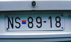
License plates on vehicles in the former Yugoslavia contained three elements: a letter code for the town where the vehicle was registered, the red star, and the registration number. New license plates differ from the old ones only in that the red star is replaced by theYugoslav flag (blue-white-red tricolour). Although the new plates were introduced in 1998, the old ones are still in use, and since the new plates were still a novelty at the time when this material was being collected, no cases of intervention on them were recorded.
To start with the most common type of intervention: denial of the red star. Numerous examples show license plates with the red star erased, destroyed or covered with adhesive tape (see pictures 1, 2 ).
 (picture 1)
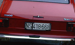 (picture 2)
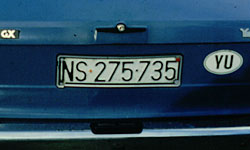
Another group of examples shows license plates in which the red star remains, but the stickers on the car reveal the person’s view on what the orientation of the country should be. It is important to note that the only official sticker for FRY is YU. In the first example (picture 3),
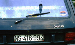 (picture 3)
the person would obviously like to live in a country whose name would be Serbia, rather than Yugoslavia (sticker SER, plus the colours of the flag of Serbia: red-blue-white). The second example (picture 4)
 (picture 4)
shows a case of a local patriot within the old boundaries – the sticker V, which stands for Vojvodina, the northern province of Serbia, is accompanied by the sticker YU, unlike the example in picture 2, where the province is the preference for identification (an independent Vojvodina?). The third plate in this group (picture 5)
 (picture 5)
is an example of wishful thinking, or a humorous response to the general situation in the country – Yugoslavia as a member of the European Union.
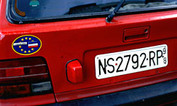
The third group of reactions offers ideas for alternatives to the red star. Not a great variety of solutions has been found.Picture 6 shows a Serbian tricolour in the place of the red star,
 (picture 6)
while picture 7 is even more explicit in that direction,
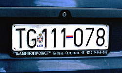 (picture 7)
featuring both the flag of Serbia and the Serbian historical coat-of-arms. What is particularly interesting in this example is that the car was not registered in Serbia, but in Montenegro, whose capital, Podgorica, was previously called Titograd (Tito City), hence TG. Finally, we present a response which is neither nationally nor territorially based (picture 8), where the red star is replaced by the red heart.
 (picture 8)
It would be simplistic to say that these responses are based on interpretations of the meaning of the red star. The meaning of a symbol is not a precisely defined category; its boundaries are fuzzy and in constant flux, depending upon the context and paradigmatic and syntagmatic relations of the symbol with other symbols and the interpreter her/himself. It would be more precise to say that these reactions are based on the interpretation of the meaning of the fact that the red star was still the official mark on license plates in FRY in the late 1990s.
The red star was a dominant symbol in Eastern Europe for fifty years; it not only represented a vehicle of expression of the dominant ideology, but also marked both the official and the dissident culture of the whole period. That period ended in Eastern Europe with the events which commenced with the fall of the Berlin Wall, and FRY was no exception to the general feeling that a change had occurred: the mere fact that these individuals felt they could desecrate the red star, once a sacred symbol, meant that there was a general implicit consensus in the society that the era of the red star (in the sense of what it meant in Eastern Europe) was over. This is why these semiotic actions do not represent a serious violation of the order nor an act of rebellion, and for the same reason, they were not treated as instances of punishable offence, though in fact, that is what they would have been under 'regular' circumstances.
Rather, these semiotic gestures can be regarded as a specific form of communication in which symbols have a central place, in a society where forms of political dialogue have ceased to function or have become distorted. They represent a sort of a public act, directed not to a specified address, but to anyone who happens to see them. They express disagreement with the social identity that belongs to the former period but is still maintained, and dissatisfaction with the fact that a new identity is still non-existent. Some of these gestures are personal statements of a particular national or territorial identity and, though naïve and politically inarticulate, they indicate a need and search for a new sense of direction. The crisis of identity and the lack of a sense of direction, which have persisted for nearly a decade in FRY, have caused semiotic and various other confusions.
As this text is being written, it seems that new flags are being designed in the Balkans. It remains to be seen what absolutely real facts with their changing meanings will emerge.
Notes:
i for more information, see the official site of the Croatian government:
http://www.vlada.hr
ii for more information, see the official site of the Slovenian government:
http://www.sigov.si
iiiArticle 7, Paragraph 2 of the agreement states:
Upon entry into force of this Interim Accord, the Party of the Second Part (Macedonia) shall cease to use in any way the symbol in all its forms displayed on its national flag prior to such entry into force.
ivfor more details and images, see The Flags of the World:
http://fotw.digibel.be/flags/
v http://fotw.digibel.be/flags/
vi After several unsuccessful attempts to start discussion about the division of assets
belonging to the former Yugoslavia, the matter has remained unresolved
between its former republics until today.
vii On several occasions at international sport events, supporters from Yugoslavia
boycotted the Yugoslav anthem, whistling and booing while it was played.
![]() 0001
a.trophy
0001
a.trophy
The
idea for this piece originated during the 78 days of NATO's operation "Allied
Forces " in Yugoslavia. It features a film-still from the documentary
film "The Last Oasis", which was shot in the early 80's, in the
Baranya County region of the former Yugoslavia, now the Republic of Croatia.
The film reveals the beauty and diversity in one of the largest wildlife refuges on the Balkan Peninsula, which has become endangered by industrial and agricultural development, as well as human disrespect for nature in general. Situated between the rivers Danube and Drava, the Oasis' marshes attract a variety of species, some extinct from the rest of the European Continent.
On October 13, 1967 the area, known as Kopacki rit, was declared a Nature Park (17,770 ha), including the Special Zoological Reserve (6,234 ha) protected since May 14, 1969. With great admiration for this small but vibrant ecosystem, director Petar Lalovic passionately explores the Oasis and reminds us of the times when wildlife was thriving in this part of Europe. The title of this film is a pivotal reference, revealing a complex narrative structure.
Consider when the film was made and recent events in the Oasis.
The early 1980's in the Yugoslav political arena were very dynamic and occasionally eruptive after 35 years of an iron regime. In May 1980 Marshal Tito died. From today's perspective his death can be seen as a turning point; after years of a progressive and comfortable socialist era, Tito's death hastened the separation of the six Yugoslav republics into five new countries. Many see Marshal Tito as the single authority figure that kept post WWII Yugoslavia together. Coincidentally, Tito was an avid hunter who enjoyed this noble activity in the region where "The Last Oasis" was filmed.
Positioned in the middle of the Balkan Peninsula, on the outskirts of the Iron Curtain, between the communist East and the capitalist West, Tito's Yugoslavia had a unique position in the global community, a virtual Oasis with its own guiding principle of self-management. Yugoslavia was part neither of the Warsaw Pact nor of NATO.
Yugoslavia, India and Egypt initiated the formation of Non Aligned Countries, at a summit in Belgrade, September 1-6, 1961. Thirty-one years later, at the meeting of Ministers of Non-Aligned Countries held in New York on 30 September 1992, it was decided that Yugoslavia cannot contribute to and participate in the activities of the NAM any longer. Yugoslavia, one of the initiators of the NAM, ended up expelled from the organisation it had founded. Radical political shifts like this one cyclically strike the Balkans. In this part of the world, a socio-political trophy frequently transforms into atrophy.
The film-still chosen for this piece shows a scene with deer shedding its antlers. This process occurs when the animal is aged and represents a turning point in the animal's life. It also redefines the value of the horns. The animal's pride and symbol of power is about to vanish. At the same time, the animal's life is becoming much safer. Today, a male deer is primarily hunted for its rustic horns, which are used for decorative purposes or to remember a successful hunt. After the horns are shed, neither hunters nor collectors value them as highly as if they were taken with the animal's skull. When found in nature, antlers can be used for many purposes, but not as a trophy. Only a killed animal is potentially a trophy.
A deer hunt may last for days, and if a hunter faces this scene he/she may experience enormous frustration. But for the camera and the director, this moment is a sparkle of nature's magnitude, a real trophy, since it captures an extremely rarely seen event in nature. It is an instant arrested, a pregnant moment when everything tips over into a new framework of meanings.
Obviously, the event itself carries antipodal references and the interpretation depends on one's point of view and the given context. In this sense, the title of the installation, a·trophy, suggests certain readings of the image and emphasizes the binary nature of the event beheld in the image (a trophy signifies power and authority, whereas atrophy signifies loss or decay of a system). When related to a certain political and military context, such as the one we started working in, the reading of the image provides material for drawing parallels and asking questions: what is a trophy and what is atrophy in a wider socio-political sense? Similarly to the variety of possible interpretations of the image, there is a variety of possible answers to these questions as well. However, it is certain that the author of the Last Oasis had never anticipated that this sequence would gain such a rich metaphorical significance and become a trophy of an atrophy.
"The
Last Oasis" was directed by Petar Lalovic, and produced by DunavFilm
Beograd in 1984
![]() 0002
The Greatest Hits
0002
The Greatest Hits
[To view webbed version of this CD-Rom project you need
NS4.x or IE4.x!]
The
Greatest Hits [TGH] is a CD Rom project which in an ironic way deals with
the idea of progress at the end of the millennium. This concept is developed
in two fields of human achievement, digital technology on the one hand and
medicine on the other, using the notion of a virus. Both computer and human
viruses are elements which disturb the balance in the system, computer or
human, however sophisticated and protected the system may be. The emergence
of a greater and greater number of both types of viruses at the end of the
millennium indicates the boomerang effect, i.e. the vulnerability of man and
technology despite the progress achieved. At the same time, virus is a phenomenon
that does not appear in an isolated system; it only occurs during an interaction
between either people or computers. Therefore, it might be said that virus
is a kind of a side-effect of communication. As our age is an age of communication,
it is also an age of viruses. Any communication carries a risk of contracting
a virus.
The Greatest Hits [TGH] contains two TOP TEN lists of these two types of viruses,
composed according to the statistical data about their harmful effects (hits,
or blows which 'hit' the mankind).
The project itself is conceived as a kind of a virus, which plays a game with
the viewer, and is, as any other virus, completely user-unfriendly. The user
has few possibilities of choice while moving through the CD Rom. In addition,
there is no exit option anywhere in the CD, alluding to the situation of no
escape in the course of the technological progress. The only two ways to exit
the project are either for the user to restart the computer, or to contract
the specially created virus, Absolutely Demo Virus [ADV], contained in both
TOP TEN lists.
![]() 0003
M
0003
M
![]() 0003 Tyme Tryeth Troth
0003 Tyme Tryeth Troth
TYME TRYETH TROTH
Project for the Improvement of the English Landscape Value
Justification
"Venerable trees should give an air of dignity and continuity to a Gentleman's Seat."
Veitch, cited in: Rackham, O. (1986) The History of the Countryside.
Aims
"...(to) enhance the exhisting landscape by judicious ... alterations."
ibid.
Present condition and guidelines for improvement
"Most of the oldest trees show significant crown dieback or other damage, and could be aesthetically improved by restrained tree surgery."
Nettlecombe
Park and Pleasure Grounds.
Historic survey and restoration plan.
Nicholas Pearson Associates LTD
Environmental Planners Landscape Architects
August 1992, p. 19/26
"Dense weed growth, dead bamboo and overhanging trees reduce appreciation of the orchard pond, which is also subject to siltation. Dense laurel precludes enjoyable access to the north corner of the pleasure grounds."
ibid. p. 19/26
"The high banks on which the hedges are planted form the next characteristic
of these counties, rendering it difficult to see the adjoining fields or country
from the road, and being really a great nuisance to a stranger. We have also
to complain of the narrowness and depth of the lanes, or parish roads and
the general want of guide-posts."
John
Claudius Loudon (1842) "Travels in Devon, Cornwall and Somerset"
in : In Search of English Gardens. National Trust Classics
Possible additional costs
"... compensation for lost grazing to the agricultural tenant would be required."
Nettlecombe
Park and Pleasure Grounds.
Historic survey and restoration plan.
Nicholas Pearson Associates LTD
Environmental Planners Landscape Architects
August 1992, p. 23/26
Outcome of the project
"... the effect ... is romantic in a very high degree."
John
Claudius Loudon (1842) "Travels in Devon, Cornwall and Somerset"
in : In Search of English Gardens. National Trust Classics
Special thanks to Tom Wolsely
Shave
97
Nettlecombe
Somerset
England
![]() 0003 Le Qauttro Stagioni
0003 Le Qauttro Stagioni
The project Le Quattro Stagioni is the result
of a one-year action, which took place during the four seasons of 1996. In
each season, one member of the association was photographed in 19th century
costume.
All four photos were taken on a site recognised by APSOLUTNO as a symbol for the place and time we live in. This is a memorial cemetery where Soviet soldiers were buried, situated on ground belonging to an Orthodox chapel. The communist memorial and the orthodox chapel stand next to each other. Thus, in this place two contrasting and co-existent symbols, the red star and the orthodox cross, are juxtaposed.
The members of APSOLUTNO are photographed as 19th century figures, looking forward to the future. Their impatience to move into the next century is symbolised in the bicycles they are all holding. In order to travel faster, they use a device which is well-known locally: a corncob put into the bicycle wheel.
The
photos were used as illustrations for the pseudo-calendar Le Quattro Stagioni,
in which dates are marked by numbers in an indication of of how many days
remain until the end of the century and millennium.
![]() 0003 Time Out
0003 Time Out
In
"Time Out" APSOLUTNO applied a strategy based on observation of,
and reaction to certain visual elements in the surroundings, chosen for their
richness of meaning. By intervening on such elements it is possible to achieve
specific conceptual as well as aesthetic effects.
In the case of "Time Out" the perceived visual detail was a composition on the wall of a building belonging to the Trinity Church, in Sombor, northern Serbia. The composition consisted of a sundial on a mural with an inscription in Serbian and Hungarian: "One of these is your last one!"
APSOLUTNO
responded to this warning by installing an awning above the sundial. By stopping
time in this way, a specific response was given to the inscription.
![]() 0003 Instrumental
0003 Instrumental
1. a musical composition played by an instrument
or a group of instruments
2. serving as an instrument or means
3. Gram. (in certain inflected langugages, as Old English and Russian) noting
or pertaining to a case having as its distinctive function the indication
of means or agency
(Random House Dictionary)
In the sound installation instrumental the art association APSOLUTNO uses
two instruments, the letter and the bullet. The two notions are generally
regarded as antipodes; the letter personifying cultural values, literacy,
transmission of knowledge and communication, and the bullet standing for destruction,
devastation, communication breakdown. However, language as a powerful weapon
has always been misused and abused. In order to emphasise this, the art association
APSOLUTNO equates the letter with the bullet, two instruments which are too
often used for the same purpose.
The
letter and the bullet in instrumental are not used as visual symbols, but
rather, as the title of the work suggests, as instrumental (aural) elements.
The common ground for these two antipodes was found in Morse code. In Morse
code, each letter is represented by a sign made up of one or more short signals
(dots) and long signals (dashes) in sound. In instrumental, APSOLUTNO replaced
short signals by the sound of shots (1 shot = 1 dot), and long signals by
machinegun fire (1 burst = 1 dash).
instrumental is a message encoded in Morse code. It is accessible by telephone,
from an answering machine installed on a telephone line. In this way, the
message is presented just like any other information given by public services.
The information about the telephone number where the message is installed is printed on cards, which are distributed in the exhibition space. Apart from the phone number, the cards contain Morse code, so that the audience can decipher the message.
The message begins with the announcement of a song - Lilli Marleen. The song is played in its instrumental version, in which the lyrics are converted into the sounds of shots and machinegun fire used as signs of Morse code. The radio announcement at the beginning of the message is taken from the soundtrack of Fasbinder's film "Lilli Marleen". It refers to the historical fact that this song was played for the first time from Radio Belgrad, in 1941. At the end of the 'song' there is a quotation from Fasbinder's film, a sentence spoken by Hanna Schigula, who plays Lilli Marleen in the film: "Aber das ist nur ein Lied!" ("But this is just a song!").
Lilli Marleen features in instrumental as a frame of reference to regimes, both historic and present, in which the letter is given the role of the bullet.
Lili Marleen
(Lieb eines jungen Wachtpostens)
Vor der Kaserne vor dem grossen Tor,
...- --- .-. / -.. . .-. / -.- .- ... . .-. -. . / ...- --- .-. / -.. . --
/ --. .-. --- ... ... . -. / - --- .-. /
Stand eine Laterne und steht sie noch davor,
... - .- -. -.. / . .. -. . / .-.. .- - . .-. -. . / ..- -. -.. / ... - .
.... - / ... .. . / -. --- -.-. .... / -.. .- ...- --- .-. /
So woll’n wir da uns wiederseh’n,
... --- / .-- --- .-.. .-.. -./.-- .. .-./-.. .- / ..- -. ... / .-- .. . -..
. .-. ... . .... -. /
Bei der Laterne woll’n wir steh’n,
-... . .. -.. . .-. / .-.. .- - . .-. -. . / .-- --- .-.. .-.. -./.-- .. .-./
... - . .... -. /
Wie einst Lili Marleen, wie einst Lili Marleen.
.-- .. . / . .. -. ... - / .-.. .. .-.. .. / -- .- .-. .-.. . . -. / .-- ..
. / . .. -. ... - / .-.. .. .-.. .. / -- .- .-. .-.. . -. /
Unsre
beiden Schatten sah’n wie einer aus,
..- -. ... .-. . / -... . .. -.. . -. / ... -.-. .... .- - - . -. / ... .-
.... -. / .-- .. . / . .. -. . .-. / .- ..- ... /
Dass wir so lieb uns hatten, das sah man gleich daraus.
-.. .- ... .../.-- .. .-. / ... --- /.-.. .. . -.../..- -. .../.... .- - -
. -. / -.. .- ... / ... .- .... / -- .- -. / --. .-.. . .. -.-. .... / -..
.- .-. .- ..- ... /
Und alle Leute soll’n es seh’n,
..- -. -.. / .- .-.. .-.. . /.-.. . ..- - ./... --- .-.. .-.. -. /. ... /
... . .... -. /
Wenn wir bei der Laterne steh’n,
.-- . -. -. / .-- .. .-./ -... . .. / -.. . .-. / .-.. .- - . .-. -. . / ...
- . .... -. /
Wie einst Lili Marleen, wie einst Lili Marleen.
.-- .. . /. .. -. ... - / .-.. .. .-.. .. / -- .- .-. .-.. . . -. / .-- ..
. / . .. -. ... - / .-.. .. .-.. .. / -- .- .-. .-.. . . -. /
Schon
rief der Posten, sie blasen Zapfenstreich,
... -.-. .... --- -. / .-. .. . ..-. / -.. . .-. / .--. --- ... - . -. / ...
.. . / -... .-.. .- ... . -./ --.. .- .--. ..-. . -. ... - .-. . .. -.-. ....
Es
kann drei Tage kosten Kamarad ich komm’sogleich.
. ... / -.- .- -. -. / -.. .-. . .. / - .- --. . / -.- --- ... - . -. / -.-
.- -- .- .-. .- -.. / .. -.-. .... / -.- --- -- -- ... --- --. .-.. . .. -.-.
.... /
Da sagten wir auf Wiederseh’n,
-.. .- / ... .- --. - . -. / .-- .. .-. / .- ..- ..-. / .-- .. . -.. . .-.
... . .... -. /
Wie gerne wollt’ich mit Dirgeh’n,
.-- .. . / --. . .-. -. . / .-- --- .-.. .-.. - .. -.-. ..../-- .. - / -..
.. .-. --. . .... -. /
Mit Dir, Lili Marleen, mit Dir Lili Marleen.
-- .. - / -.. .. .-./.-.. .. .-.. ../ -- .- .-. .-.. . . -. / -- .. - / -..
.. .-./ .-.. .. .-.. ../ -- .- .-. .-.. . -. /
Deine
Schritte kennt sie, Deinen zieren Gang,
-.. . .. -. . / ... -.-. .... .-. .. - - . / -.- . -. -. - / ... .. . / -..
. .. -. . -. / --.. .. . .-. . -. / --. .- -. --. /
Alle abend brennt sie, doch mich vergass sie lang.
.- .-.. .-.. . / .- -... . -. -../ -... .-. . -. -. - /... .. . /-.. --- -.-.
.... / -- ..-.-. .... / ...- . .-. --. .- ... ... /... .. ./.-.. .- -. --./
Und sollte mir ein Leids gescheh’n,
..- -. -.. / ... --- .-.. .-.. - . /-- .. .-. / . .. -. / .-.. . .. -.. .../--.
. ... -.-. .... . .... -. /
Wer wird bei der Laterne stehn,
.-- . .-. / .-- .. .-. -.. / -... . .. / -.. . .-. / .-.. .- - . .-. -. .
/ ... - . .... -. /
Mit Dir, Lili Marleen, mit Dir, Lili Marleen?
-- .. - / -.. .. .-. / .-.. .. .-.. .. / -- .- .-. .-.. . . -. / -- .. - /
-.. .. .-./.-.. .. .-.. ../ -- .- .-. .-.. . -. /
Aus
dem stillen Raume, aus der Erde Grund,
.- ..- .../ -.. . -- / ... - .. .-.. .-.. . -./.-. .- ..- -- ./ .- ..- .../
-.. . .-. / . .-. -.. . / --. .-. ..- -. -.. /
Hebt mich wie im Traume Dein verliebter Mund.
.... . -... - / -- .. -.-. .... / .-- .. . / .. -- / - .-. .- ..- -- . / -..
. .. -. / ...- . .-. .-.. .. . -... - . .-. / -- ..- -. -.. /
Wenn sich die spaten Nebel dreh’n,
.-- . -. -. / ... .. -.-. .... / -.. .. . / ... .--. .- - . -. / -. . -...
. .-.. / -.. .-. . .... -. /
Werd’ich bei der Laterne steh’n,
.-- . .-. -.. .. -.-. .... / -... . .. / -.. . .-. / .-.. .-. - . .-. -. .
/ ... - . .... -. /
Wie einst Lili Marleen, wie einst Lili Marleen.
.-- .. . / . .. -. ... - / .-.. .. .-.. .. / -- .- .-. .-.. . -. / .-- ..
. / . .. -. ... - / .-.. .. .-.. .. / -- .- .-. .-.. . . -. /
Morse
code:
A . -
B - ...
C -.-.
D -..
E .
F ..-.
G --.
H ....
I ..
J .---
K -.-
L .-..
M --
N -.
O ---
P .--.
Q --.-
R .-.
S ...
T -
U ..-
V ...-
W .--
X -..-
Y -.--
Z --..
![]() 0003 Good Evening
0003 Good Evening
The
project "Good Evening" has been realized in the media of a video
and a booklet. Both parts focus on the role of the media at the end of the
20th century. While the video "Good Evening" makes reference to
the medium of television, the booklet "Good Evening" refers to the
medium of the press. The link between the two parts is established by the
use of the same sentence "Good evening" - the standard way tv news
readers address their viewers at the beginning of the news.
The
sentence also implies the 'evening' of the century and millennium. In the
booklet, this sentence is written using the logos of the main daily newspapers,
in the corresponding languages. The only other element of the booklet is the
pagination, which, instead of numerals, consists of symbols used to mark moves
in a game of chess. After 32 moves, the same number as the number of pages
in this publication, this game of chess ends in a checkmate, a situation from
which escape is impossible.
![]() 0004 Belgrade 00,04
0004 Belgrade 00,04
![]() 0004 Human
0004 Human
The project HUMAN is focused on the global
events on the European territory. Marking the borderline which divides Europe
into East and West is in the basis of the project. This borderline has a long
history during which it has gone through a number of changes, but its meaning
always prevailed. This borderline exists as an invisible curtain which either
tolerates or prevents different forms of communication on various levels.
Since 1989 and the fall of the Berlin wall, we have been witnesses of a geopolitical
regrouping followed by the disappearance of borders between the states in
the western part and the establishment of the new "united" Europe,
while in the eastern part a multitude of new nationalistic states with strictly
controlled borders were formed. In this action the association APSOLUTNO marked
the above mentioned line (WE-EE) by placing a traffic sign with the inscription
"MAN" on no-man’s-land between the borders of the countries
along the line. Thus the association pointed out the (in)equality of PEOPLE
and their destinies in both of these entities of European territory. The word
HUMAN which is on the signs, is written in the official languages of the neighbouring
countries.
The invisible borders
Apart from marking the borderlines which divide Europe, parallel part of the
project HUMAN is recognition and marking of the "invisible" lines
which divide a geographical whole or an urban entity. The divisions instigated
by war, economic, legal, political or cultural disputes, cause a form of (un)communicativeness
between people. These borders carry psychological weight because unlike official
borders they have no barriers nor signs but it is obvious that the border
exists.
Example: The action* of marking the invisible border carried out in Mostar
in 1996, Bosnia and Hercegovina * Armin (18), division line between east and
west Mostar, Bosnia and Herzegovina
![]() 0004 Tiertransport
0004 Tiertransport
In
this action APSOLUTNO used official certified documents (used in Yugoslavia)
- permissions for transport of animals outside of the country. The forms were
filled with the data referring to people of various professions, such as:
artist
Kunstler
athlete
Sportler
beggar
Bettler
craftsman
Handwerker
criminal
Kriminelle
farmer
Bauern
housewife
Hausfrauen
physician
Doktoren
pensioner
Pensionisten
professor
Professoren
prostitute
Prostituerte
pupil
Schuler
student
Studenten
worker
Arbaiter
With these ironic changes of identity the association symbolically legalized
emigration of the war refugees on the territory of ex-Yugoslavia.
According to the United Nations High Commissioner for Refugees every fifth
inhabitant of the planet is a refugee.
![]() 0004 In memoriam
0004 In memoriam
The starting point for IN MEMORIAM, a project
realized on the occasion of the 1000th anniversary of Austria, was taken from
the recent history of the Balkans. IN MEMORIAM is based on a parallel drawn
between two important events in Austrian and Yugoslav history: the assassination
of Prince Franz Ferdinand in Sarajevo in 1914, and the assassination of King
Aleksandar Karadjor|evic in Marseilles in 1934.
Two authentic banknotes from the perid, the Austrian Crown and the Yugoslav
Dinar, were used in this project. APSOLUTNO exchanged both the images of the
monarchs and their respective coats of arms on the banknotes. In this way
two new bank notes, the APSOLUTNO Crown and the APSOLUTNO Dinar were created.
The exchange rate between the two currencies was then determined and entered
into the official currency list of one of the Austrian banks. According to
the list, these two currencies are of equal value.
IN MEMORIAM was first presented at the Merzweckbau Symposium in Schrattenberg,
Austria in 1996.
![]() 0004 Warning!
0004 Warning!
This
installation was realized for the opening of one of the more significant group
exhibitions in Belgrade. As the basis of its intervention the association
APSOLUTNO chose plastic notice-board with the data such as working hours,
which can be usually found on the entrance doors of stores, offices, galleries
etc.
The notice-board which was placed on the entrance door of the gallery had the following text: Warning! You are entering the gallery on absolutely your own responsibility.
With this intervention the association APSOLUTNO emphasized the differences and parallels in the relation between life and art.
April,
1996, Belgrade
![]() 0004 Absolutely Temporary
0004 Absolutely Temporary
Is
it possible to determine the borderline between the temporary and the permanent?
That question instigated this project. The project is centred around the bridge
on the 1261 kilometer downstream the Danube, which connects Petrovaradin and
Novi Sad (Vojvodina, Yugoslavia). The bridge was built in 1945 as a temporary
solution and the intention behind it was to replace it with a new, bigger
and more beautiful one. Various circumstances got in the way and prolonged
its temporary character till nowadays.* Finally by placing the memorial plaque
42 years later (1987) the bridge was inaugurated in the "Marshal Tito’s
Bridge" and transformed into an object of permanent historical value.
However the plaque disappeared two years afterwards.
The association APSOLUTNO recognized the story about the bridge as a universal illustration of an absolutely temporary condition and as a platform for re-examining the relations between temporariness and permanence of things.
As a part of the project APSOLUTNO performed a ceremony during which a new plaque with the inscription "Absolutely temporary" was unveiled.
*
The bridge was destroyed during a NATO air attack on 1 April 1999.
![]() 0004 Absolutely Nike
0004 Absolutely Nike
A
photo action of marking the four remaining objects on the Athenian Acropolis
on January 1, 1996
Throughout the history this place has changed its function and character. During the numerous attempts to conquer Athens, it suffered considerable damage, but in spite of that it has still continued to be one of the most significant monuments of European civilization and one of the most popular tourist attractions in the world.
However, the largest part of the complex is artificial, which can be illustrated by numerous facts. The maintenance of the object close to the original condition is being achieved by the "temporary architecture" and teams of experts and archeologists from all over the world are working on it. It is well know that, for example, the Caryatids on Erechtheum, the friezes on the Temple of Athena Nike, as well as that most of the huge stone block are not original.
On the other hand, pollution and industrial waste present an acute global problem. Acid rains have done more damage in the last couple of decades to the objects on the plateau of Acropolis than the last 2500 years. The alarming state of the monuments prompted organizations for the protection of monuments of culture to invest in the conservation of the monuments. But the conservation is performed as plagiarism, and monuments are redone in modern and more resilient materials. Thus saved from further deterioration, monuments are subject to new readings and interpretations.
The association APSOLUTNO chose Athenian Acropolis as a clear example of the ambivalent initiative of the governing political structures who by conserving the monuments of culture, transform them into the monuments of the civilizational progress. Such processes of fabrication of artificial ambients which are presented to the public as historical artifacts correspond to the basic principles of VR. Using this sophisticated method of deceit, centres of power create even greater manouvring space with the absolute victory of capital as their ultimate goal.
The
remaining four objects at the same time symbolize the last four years till
the end of the century and millennium.
![]() 0005 I am absolutely ...
0005 I am absolutely ...
I AM ABSOLUTELY EVERY MOMENT ABSOLUTELY HERE
This
project was inspired by the theory of a group of physicists active at the
beginning of the 20th century which believed that comprehensive reality consisted
of spatially discrete elements connected by intrinsic non-local ties. Einstein
did not accept this theory; he carried out conceptually the EPR (Einstein-Podolsky-Rosen)
experiment in order to prove that non-local ties did not exist and that there
were hidden variables which humankind was still not capable of discovering.
However, he proved precisely the opposite, paradoxically shaking his own understanding
of quantum physics. The result of this experiment - which was later carried
out by Bell - proved that two electrons rotating in opposite directions present
an indivisible whole connected by interdependent links into an absolute unity
regardless of how distant they are from each other. The sculptural nature
of such a system cannot be comprehended in terms of discrete elements. Both
particles of the rotat
ing electron connect by momentary non-local ties which surpass our civilizational
mental patterns*.
The
sentence - 'I am absolutely every moment absolutely here' - was sent from
Sombor to Horn,
thence to Vienna, and then on to Novi Sad and so completed a circle functioning
as a synonym of the absolute. By its cyclical form and its contents this project,
in a simple way, formed the territory of the absolute constructed space and
the absolute temporal span.
The
project was carried out in 1995 at the end of November through to early December.
* Revised from Fritjof Capra, The Tao of Physics
![]() 0005 A36YKA absolut in Wien
0005 A36YKA absolut in Wien
This
project was realized during a three-month stay of the art association APSOLUTNO
in Vienna in 1995. It started as a reaction to various aspects and connotations
of the environment in which APSOLUTNO found themselves.
With all its historical connotations, Vienna is connected to Serbian culture in a unique way. One of many events that occurred in Vienna and have had a significant impact on Serbian culture is related to the creation of the Serbian Cyrillic Alphabet - the AZBUKA. Vuk Stefanovic Karadzic (1787-1864), "the creator of the standard Serbian language and literature"*, printed the first Dictionary of the Serbian language using the AZBUKA in 1818. AZBUKA is still used as one of the two official alphabets in Yugoslavia. The Dictionary was printed in the Mechitharisten Monastery printing house in Vienna (Mechitaristengasse 4).
On the city map of Vienna, APSOLUTNO pointed out all thirty letters of the AZBUKA, formed by the directions of the streets. This was followed by an action in which APSOLUTNO, with the permission and the assistance of the Viennese police, blocked the traffic in these streets with a yellow emergency ribbon. At the same time, each house or building in the streets comprising the "letters" was marked with a label with the following text in German: "This house absolutely lives in the letter ...". The labels had the same layout as the street-name plates in Vienna, and were written in the same letter font. Finally, a brochure about the action was printed in the Mechitharisten Monastery, in the same printing house in which Vuk Stefanovic Karadzic's Dictionary was originally printed in 1818.
An integral part of the project is a version of the first German - Serbian Dictionary published by Jovan Kangrga in 1928. In this 'Dictionary', all words have been erased; only the punctuation marks remained, in their original positions. Five copies of the dictionary were made.
This project was conducted during the war in former Yugoslavia, when, due to the UN sanctions against F.R. Yugoslavia (of which Serbia is a part), communication between Austria and Serbia became extremely difficult. By blocking the traffic in the streets of Vienna and erasing the words from the original dictionary, APSOLUTNO referred to the block in communications between Austria and Serbia, in spite of a long tradition of strong cultural links between the two countries.
*Quotation
from the memorial plaque on the house in Marokkanergasse 3, Vienna, where
V. Karadzic died.
![]() 0005 Absolutely Dead
0005 Absolutely Dead
The association has conducted an investigation
of a death of two transoceanic liners under suspicious circumstances. They
are found in Novi Sad, Vojvodina, Yugoslavia, between the 1,258th and 1,259th
kilometre of the Danube. The ships lie parralel to each other with their bows
turned towards the south-west. The ships are 105 metres long and 16.2 metres
wide. The main deck is 9 metres high on both ships. Their cargo capacity is
5,700 tons. There are no visible traces or signs on the spot which undoubtedly
indicate a certain cause of death. The position of the ships, as well as the
place and time they were found in, indicate an absolutely death. The investigation
was conducted on 21 September 1995, from 6 pm to 9.30 pm.
![]() 0005
News[Paper]
0005
News[Paper]
Time: July, 1995, war on the territory of ex-Yugoslavia;
sanctions and media blockade; absolute control of the media by the political
regime in Belgrade.
The object of action was a newspaper kiosk out of function. Through the glass panes of the kiosk one could see a brick wall. This form of "remodeling" was a common occurrence at the time of the severest economic crisis in Yugoslavia during the nineties. It was a way to avoid paying building permits and taxes.
The association APSOLUTNO put the sign NEWS[PAPER] on the door and thus "reactivated" the kiosk. With the sign NEWS[PAPER] the whole situation, including the place and time gained a completely different connotation. The text accompanying the photograph is the quotation on censorship taken from the encyclopedia in the edition of the Leksografski zavod, Zagreb, 1966.
Newspapers have always been subjugated by the authority in power [unless, of course, the paper in question is the mouthpiece of the authorities]; the Establishment jealously guards the privilege of controlling and censoring what is printed or published. One of North America's greatest journalists, Benjamin Franklin, had to cease publication of his newspapers several times under the coersion of royal censorship.
The French Revolution gave powerful impetus to the development of journalism; revolutionary ideas and social upheaval provoked the interest of the masses. Newspapers became a weapon in the struggle against the ancien régime and their number significantly increased during the first years of the Revolution. However, Napoleon's regime suppressed the freedom of press and permitted only semi-official papers to circulate in the areas under rule. The restoration of the "legitimate" monarchy and the Holy Alliance did not herald the reinstatement of the freedom of press: newspapers were prohibited from addressing political issues candidly.
from The Encyclopedia of the Lexicographic Institute, Zagreb MCMLXIII [revised]
The
project 'Absolute News[papers]' was carried out in July 1995 at the Fish Market
in Novi Sad
![]() 0005 BREAKthrough [PRElom]
0005 BREAKthrough [PRElom]
The
installation addresses the issue of war and presents it as a circus arena.
0n the front wall there are two shotguns, one below the other, in a broken position. The upper one is ready to be reloaded and used again, while the lower one is completely broken and unfit for usage. In that position they also form the visual archetype of the military insignia. The floor is covered with saw dust and metaphorically it brings into focus the territory of the whole region and puts it on the level of the circus ring.
The installation was realized for the first time on May 25, 1995, the date which was celebrated in x-Yugoslavia as the birthday of the president Josip Broz Tito†.
For
the second time the installation was realized at Kwangju Bienniale in 1997,
Hybrid section, but with important alterations: the shotguns in the installation
which were taken from the Kwangju police archive had been used in the government’s
retaliation on the citizens who took part in the revolution in South Korea
in 1980.